Why does it seem like churches are allergic to good design? From layout to color schemes to navigation and picture quality, many churches act like they are not worthy of a beautiful and professional website.
The other thing we hear from churches is that they don’t want their websites to look too “slick,” which often translates to, “look too expensive.” When it is simple to design a beautiful website for the same price as an ugly one, it is not as if an attractive website communicates a wasteful expenditure. No, a well-designed website is actually a smart use of your resources.
We must remember, too, that websites are for visitors, not for people already in the church. And we hope that many of those visitors are people who may not even know much or anything about Jesus or church. Those visitors will be accustomed to quickly judging a business or organization by its website.
Think about your own experience on the internet – if it is hard to navigate or find what you are looking for on a website, how do you feel about using it again or even giving business to that company? The same goes for church websites.
Good pictures, a friendly color scheme, important information clearly marked, menus that are easy to navigate, and language that is easy to understand – these are elements that make up any good website. If you spend some time on the internet, and your website feels old and clunky compared to other sites, it probably needs an update.
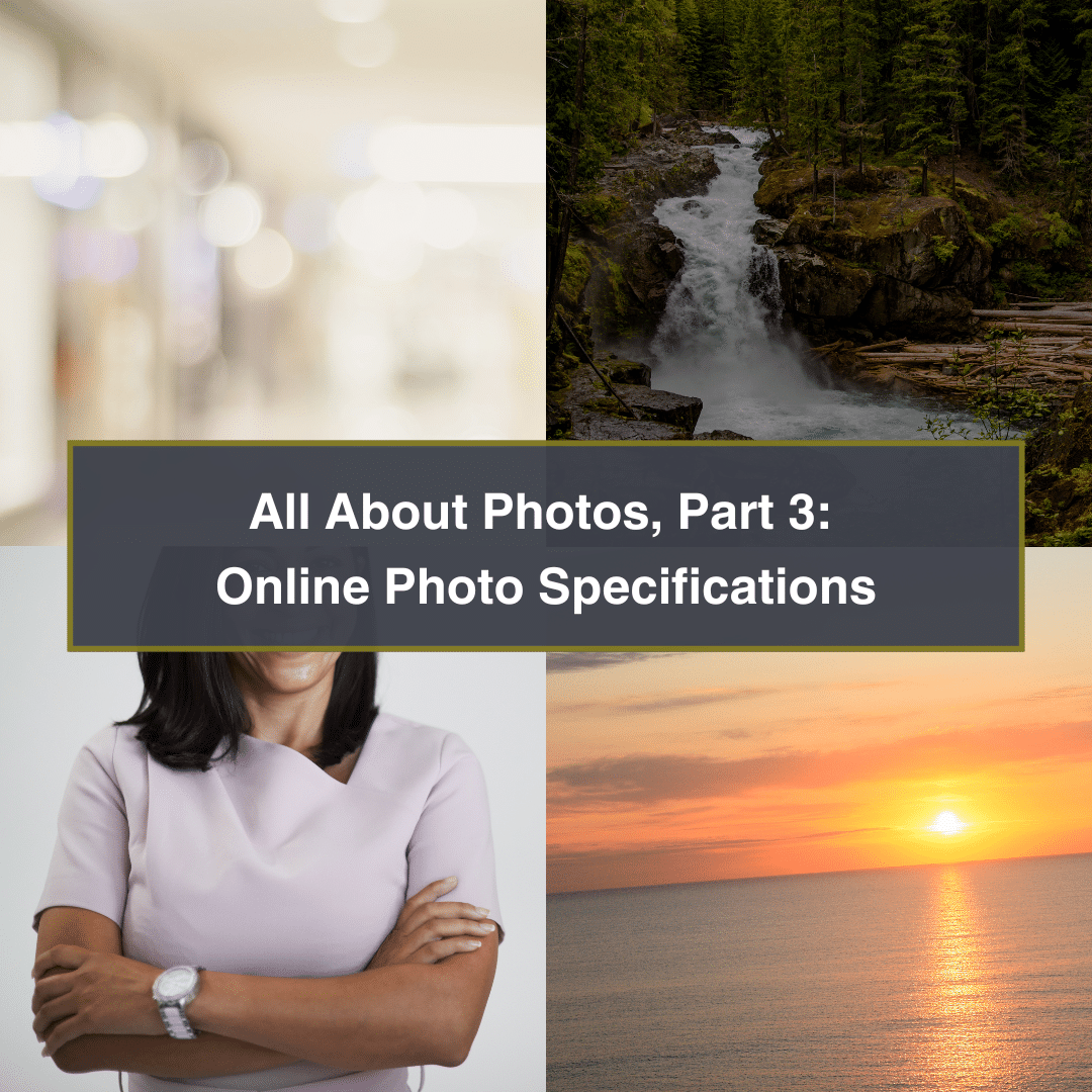
If you missed them, read Part 1: Getting Photos and Part 2: Photo Storage, Collaboration & Organization. You’re finally taking and collecting amazing photos! But it can be frustrating when…
Email providers have implemented new restrictions on SPF (Sender Policy Framework) and DKIM (DomainKeys Identified Mail) to enhance email security. Here’s what you should be aware of: SPF and DKIM…
Once upon a time, the internet used to be a very black-and-white place. Text was king. Over time, colors, patterns, graphics, photos, videos, animations, and more emerged and began competing…
Many people are familiar with WordPress. It’s known as the easy, “free” open-source environment used worldwide by millions of people to build and manage websites. But WordPress isn’t a single…
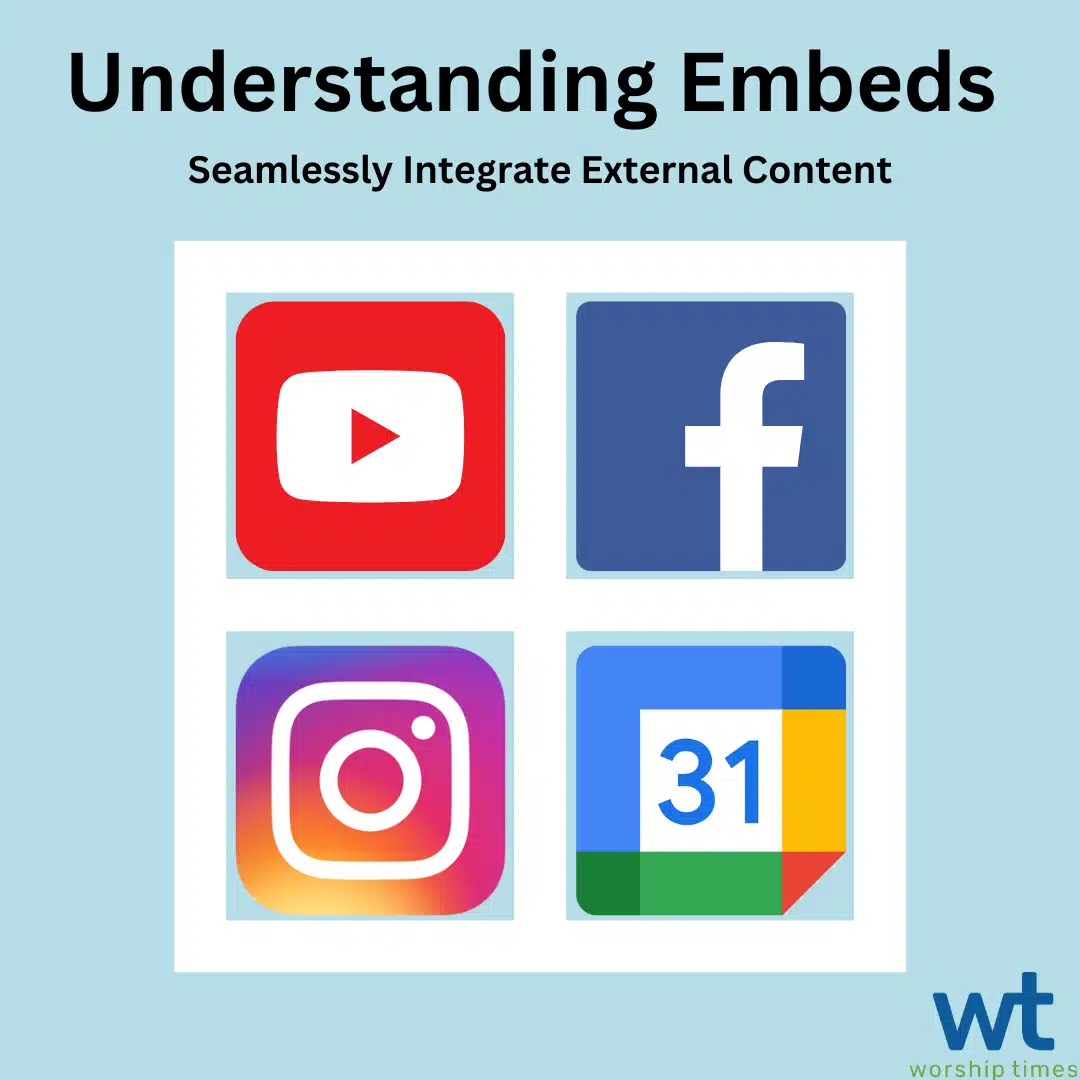
What is an embed? Embeds contain content from an external platform. Most often, this is in the form of a script, provided by the external platform, allowing you to display…
One question I get asked often when meeting with a new ministry is, “what can we expect in this process?” In today’s blog post, we walk you through what to…
 schemes to navigation and picture quality, many churches act like they are not worthy of a beautiful and professional website.